Monday, April 11, 2011

Components - Emotional Design

In this project we were to use an object that does not generate a whole lot of feeling and create a poster using that object to create an emotion. I chose a book. For most people books don't hold a lot of feeling. Books may create feeling when you read them, but they don't hold much feeling just looking at it.
Image 1 - book from stockvault.net
I opened the image of the book in Photoshop and cut out the background, I wanted it to be on a black background as opposed to the white one that it was one. I then chose a picture of fire and placed that over the book. I made the fire layer transparent so that you could see the book through the flames. I also flipped it so that the larger flames were on the more open side of the book, I just thought it looked better on that side.
Image 2 - fire from stockvault.net
After adding the fire and seeing where the book might have burned edges I used a pen tool and the smudge tool to create the burnt edges of the pages. I added text to the pages on the left and added the title "Banned Books" to the right to finish my poster.

Image 3 - final product "Banned Books"
I hope that the image generates some anger or hostility towards the idea of banning books. Working in a library I am against censorship. Books are a way for people to learn and experience. It saddens me that books are taken out of schools. In the context of schools I feel that banning books only makes them more appealing to kids. Off my soapbox...I am very pleased with the final product.


Components - Word Portraits

For this project I used PowerPoint to create Word Portraits. First I chose different fonts that have a strong "voice" and wrote the word I felt they were portraying.

Font: Lucida Blackletter
For this first Word Portrait I chose a font called Lucida Blackletter. I felt like it looks very Gothic, like something from Camelot. I chose colors that seemed kind of sepia toned for this as well, again to portray an aged feeling.

Font: Herculanum
For the second Word Portrait I chose Herculanum which reminds me of Hercules and mythology. I chose a blue background because when I think of mythology I think of earth, sea and sky, natural things.

The second part of the project was to chose a font and write a word that contradicts the "voice" of the font.

Font: Curlz MT
 For this first one I used Curlz MT, which to me is very girlie and young. I chose to write the font in pink on a purple background because those also scream girlie to me. The word I wrote was Manly because that is very far from being girlie in my mind.

Font: Zapfino
This final Word Portrait is in Zapfino, a very elegant and artsy font to me. I chose to write the word Plain because I don't think it is plain, I think it is far from plain. I used black which is plain and every day for a font color, it is even referred to as "Automatic" in most text writing programs.

Components - Legibility & Text Safe Areas


For this project I found a picture on stockvault.net of the kiwi. I used PowerPoint to create an invitation. I inserted Word Art that had a shadow for "You're invited!" so that it would stand out on the background of the kiwi. The main text that gives the invite information I put on top of a transparent box to emphasize the text but still be able to see the kiwi beneath.

Components - Second Life Prims


For this project we went into Second Life, a 3D virtual world and created objects. These objects are called prims. Prim is a shortened version of "primitive" and refers to the 3D polygonal shapes used by residents to build objects in Second Life.
The first prim I created was a tube. It started out looking something like this:
 I adjusted the shape and added a picture to the surface of the prim. In Second Life I took a screen shot of the prim and this is how it turned out:
I also created a spherical prim that started out looking like this:
I added a texture, glow and adjusted the size and it ended up looking like this:
I really enjoyed experiencing Second Life. It was interesting to create a prim. It is hard to imagine building an entire structure out of these prims. It would be a lot of work and a lot of time. I did enjoy playing with creating 3D objects though. 

Monday, February 28, 2011

Components - Gestalt & Icons

Exercise 1
Gestalt Theory

The basic concept of the Gestalt theory is that the whole is greater than the sum of it's parts. This theory is related to visual perception and the study of shapes and patterns. There are four principles. For this exercise we were to create a simple picture of one of the concepts. I chose to try two different concepts.

Closure - We attach meaning to visual displays


I used simple shapes in PowerPoint to create this picture. There are two arches that are not touching but the eye still sees the oval that the two arches create.


Similarity
- We group similar objects together in a meaningful way. 


Again, I used simple shapes in PowerPoint to create a pattern. The eye will automatically group together the circles and the stars.


The other principles are:
Proximity - We group things that are physically close to one another, in a meaningful way.
Continuity - We look for unity in objects


Exercise 2
Icons

This exercise was to make an icon using an everyday object. I chose a picture of a bicycle from stockvault.net
Original


We then selected identifiable parts of the object. I circled the handlebars, seat, wheel, and peddles. 
Step 1

I chose the peddles and part of the tire as the most identifiable part.
Step 2

I then used PowerPoint to create an icon of the section of the bike. I used simple shapes to create a simple grey and black picture of the bike.
Step 3 - Icon

I really enjoyed creating this icon and think it turned out pretty well!

Tuesday, February 22, 2011

Composition - Color & Emphasis

Exercise 6
Color

For this project we started with an image. I chose a high heel from stockvault.net.


I opened the shoe in Photoshop and deleted the background copying the picture to a new window. I copied the shoe three times and changed the size of each. I changed the color of the middle shoe to a bright red.


Exercise 7
Past & Present

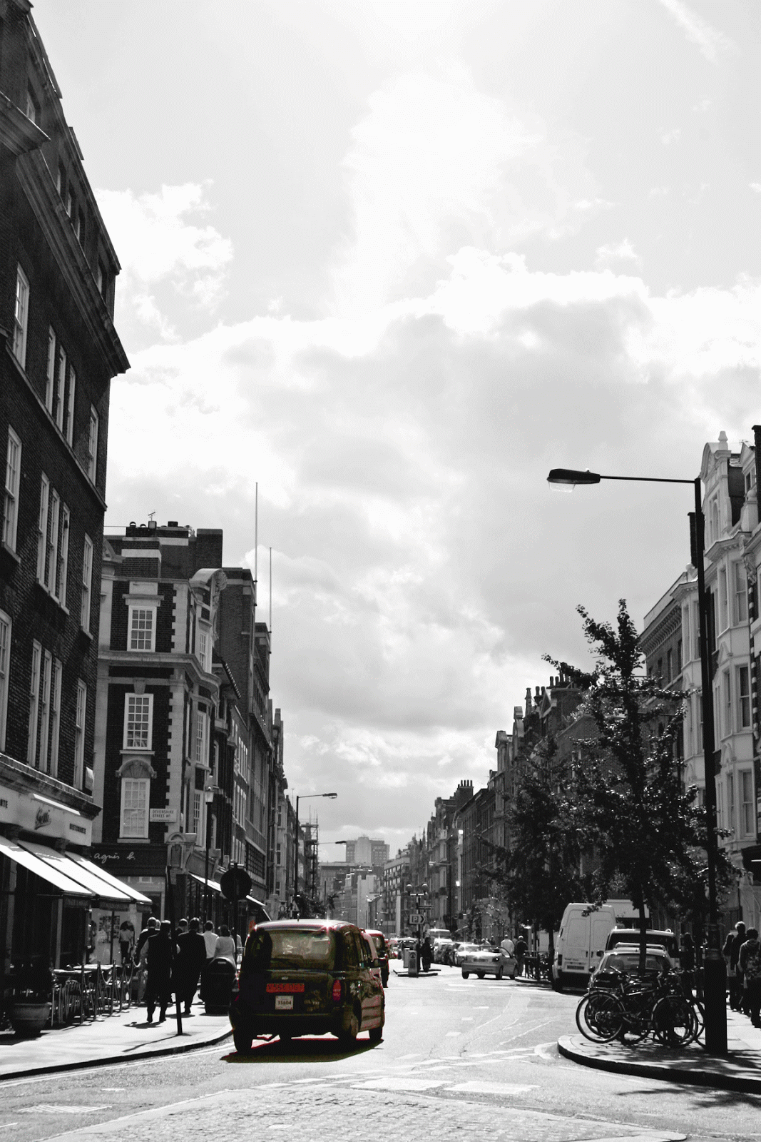
For this exercise we were to choose a picture of a street scene an change the picture to black and white to make it look old, and then choose one part of the picture to leave in color to make it look current. I chose a picture of a busy intersection on stockvault.net. 


I opened the picture in Photoshop and changed the original photo to black and white using the Adjustments panel.  I then used the magnetic lasso tool to select the yellow bus. I pasted that on the top layer. I used the saturation tool to make the bus a brighter color. I also adjusted the different colors in the black and white layer to make the colors even more different than the yellow bus.


I really enjoyed working on these exercises to use color to emphasize something in the pictures. I especially enjoyed the Past & Present exercise and even tried a couple other pictures.


The original of this picture was not as colorful so it was a little harder to change a colored item and make it stand out. I had to do a lot of changing saturation and colors in black and white. But it is a fun thing to play with.

Composition - Alignment

Exercise 5
Alignment


This exercise is to demonstrate alignment. For this exercise I used PowerPoint to design an ad for an imaginary company. I chose to align the picture in the center. The text under it is also center aligned.  I made the picture large to draw the viewer's attention.

Friday, February 4, 2011

Composition - Grouping & Theme

Exercise 4
Grouping & Theme

This exercise was to show how grouping can convey thoughts or themes. By grouping images together in different ways we are able to communicate a message. The way images relate to each other can support the idea the artist or designer is trying to get across.
For this exercise we used Power Point to create seven different slides with seven different words and ten shapes to express the words on each slide. I used shape, size and color to emphasize my point in the slides. It is amazing how these things can effect a viewer's concept of an idea.


Unity - For this word I chose the plus symbol because unity to me adding together to be one. The circle is always something I think of when I think of unity as well. And the color yellow is because it's a happy color and to me I think of happiness when I think of unity.

Celebration - This was the hardest slide for me. I had a hard time trying to decide how to illustrate Celebration with grouping, shapes and colors.  I chose stars because they, to me, are synonymous with celebrating! I chose bright colors, pink and yellow, to emphasize high spirits. I tried to group the stars in a way similar to a firework or confetti being thrown. It was a hard concept for me to express with grouping.

Isolation - For this slide I chose the cloud shape because it can be happy or sad. I separated one cloud from the others and made it blue because I think of sad rain clouds when I think of blue clouds. The other white clouds are in the opposite corner and are together in one large group but also in smaller clusters. It's kind of like a party when one person doesn't really know anyone. People are gathered in clusters of their friends but that one person is the odd one out. It can feel very isolated.

Escape - For this slide the idea I had was escaping from the crowd, from doing what everyone else is doing. I chose arrows to show the different direction the one is going from the others. The formation of the others is to show similarity in those arrows. In my head as I was thinking of this the crowd I had in mind was girls in high school all doing the same things and going against the stream to escape that sameness, that's why I chose purple, a girly color.


Intimidation - For this slide I chose lightning bolts which can instill fear. I made one larger than the others to tower over the others, another way people sometimes instill fear in others. The other lightning bolts are cowering in the corner in a a tight cluster implying that they are scared of the other, larger lightning bolt. I chose the color black because it is an ominous color.

Logic - The idea that comes to mind when I think of logic are puzzles. There are correct ways for things to be and there is organization and structure. I chose the octagon because of the straight edges and obvious shape. The grouping of the ten shapes is very structured and organized in a pyramid formation.


Anarchy - The idea behind this slide was the chaos and disorganization of the shapes. The star burst shapes are loud and chaotic, jarring. The color red is bright and bold. I made the shapes different sizes to also give a feeling of unruliness.