Monday, April 18, 2011

Concepts - Typographical Conveyance

Image 1
Image 2


For this project we were given a list of words that we then used fonts, color, and graphics to convey an idea or theme. The first word was "atom". I did two different versions of this. Image 1 I created in PowerPoint. I used Auto Shapes to create the circles and then added the letters on the atom as neutrons. Image 2 I created in Photoshop. I used the Shape tool where there was already an atom shape. I used this as the "o" in "atom" and added the other letters on either side.
Image 3
For the word "lightly" I put the word on a light colored background and typed "lightly". I then increased the opacity of the word so that it seemed faded. I was trying to convey lightness. 
Image 4
For the word "shred" I typed it in a bold, all caps, sans sarif font. I then used the eraser tool in Photoshop to make it look like it was shred by claws or some other scratching. 
Image 5
The word "pillow" I typed in a rounded font. I overlaid it on a square. I transformed both to make it a pillow shape, extending it in the middle and making it smaller on the ends.
Image 6
I typed "brick" on top of a brick background. The font I used had no fill so that the brick came through.

Image 7
The final word/phrase was "xxl". I chose a font that you might see on t-shirts for xxl. I chose to make each letter get larger.
This project felt difficult for me. I had a hard time thinking of and creating these. I think my favorite was "atom". I like the use of fonts and objects to create an obvious play on the word.

Tuesday, April 12, 2011

Components - Color Echo

Image 1
Image 2


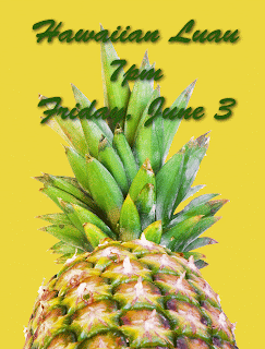
For this first  poster I went with a pineapple. I used the eye dropper tool in Photoshop to catch color from the pineapple to use as the background and font color. For Image 1 I took a yellow color from the leaves to color the background and then a dark green also from the leaves for the text. Because the green text was going to be over the green leaves I also added a shadow to the text to make it pop out a bit. For Image 2 I chose a yellow from the pineapple skin for the background and a brown-purple color from the skin for the text.

Image 3

For Image 3 I went with a pomegranate. I chose colors from the seeds for the background and both sets of text. 
For both of these objects as I was searching for colors in the fruits I was very surprised to see the variation and number of colors there were. You don't think about how many colors are in a fruit until you have the eye dropper and are catching all the different colors in a small space.

Components - Fonts and Images


For this project I used Photoshop to create a logo for a company. The idea was to combine both fonts and images to portray the idea. I chose a pair of scissors and used it as the "A" in tailor. I combined two fonts, "Perfect" in Lucida Calligraphy and "Tailor" in Rockwell Extra Bold, to give some contrast. I also adjusted it for a second logo where I crossed the "A" with a ribbon to make it look more like an "A".  It turned out like this:


I'm not sure which I like better. I do like the addition of ribbon to the scissors. But also like the clean look without. I like the way both turned out.

Components - Hue & Saturation

For this project we worked with changing the hue and saturation of a picture in Photoshop. I chose a picture of vegetables with lots of color.
Originial picture from stockvault.net
This first adjustment was changing the hue to -40. This took out the yellows and gave everything a red tone.
Hue
The second adjustment was changing the saturation to +90. The colors seem much brighter, more intense, almost fake.
Saturation
The final adjustment was to the value or the lightness/darkness of the picture. For this one I left the colors slightly saturated and changed the value to +49. To me it looks like the color was sucked out of the picture. It is very light.
Value
It was interesting to experiment with these concepts. To see how changing these things can change the picture and get a different look.

Monday, April 11, 2011

Components - Emotional Design

In this project we were to use an object that does not generate a whole lot of feeling and create a poster using that object to create an emotion. I chose a book. For most people books don't hold a lot of feeling. Books may create feeling when you read them, but they don't hold much feeling just looking at it.
Image 1 - book from stockvault.net
I opened the image of the book in Photoshop and cut out the background, I wanted it to be on a black background as opposed to the white one that it was one. I then chose a picture of fire and placed that over the book. I made the fire layer transparent so that you could see the book through the flames. I also flipped it so that the larger flames were on the more open side of the book, I just thought it looked better on that side.
Image 2 - fire from stockvault.net
After adding the fire and seeing where the book might have burned edges I used a pen tool and the smudge tool to create the burnt edges of the pages. I added text to the pages on the left and added the title "Banned Books" to the right to finish my poster.

Image 3 - final product "Banned Books"
I hope that the image generates some anger or hostility towards the idea of banning books. Working in a library I am against censorship. Books are a way for people to learn and experience. It saddens me that books are taken out of schools. In the context of schools I feel that banning books only makes them more appealing to kids. Off my soapbox...I am very pleased with the final product.


Components - Word Portraits

For this project I used PowerPoint to create Word Portraits. First I chose different fonts that have a strong "voice" and wrote the word I felt they were portraying.

Font: Lucida Blackletter
For this first Word Portrait I chose a font called Lucida Blackletter. I felt like it looks very Gothic, like something from Camelot. I chose colors that seemed kind of sepia toned for this as well, again to portray an aged feeling.

Font: Herculanum
For the second Word Portrait I chose Herculanum which reminds me of Hercules and mythology. I chose a blue background because when I think of mythology I think of earth, sea and sky, natural things.

The second part of the project was to chose a font and write a word that contradicts the "voice" of the font.

Font: Curlz MT
 For this first one I used Curlz MT, which to me is very girlie and young. I chose to write the font in pink on a purple background because those also scream girlie to me. The word I wrote was Manly because that is very far from being girlie in my mind.

Font: Zapfino
This final Word Portrait is in Zapfino, a very elegant and artsy font to me. I chose to write the word Plain because I don't think it is plain, I think it is far from plain. I used black which is plain and every day for a font color, it is even referred to as "Automatic" in most text writing programs.

Components - Legibility & Text Safe Areas


For this project I found a picture on stockvault.net of the kiwi. I used PowerPoint to create an invitation. I inserted Word Art that had a shadow for "You're invited!" so that it would stand out on the background of the kiwi. The main text that gives the invite information I put on top of a transparent box to emphasize the text but still be able to see the kiwi beneath.

Components - Second Life Prims


For this project we went into Second Life, a 3D virtual world and created objects. These objects are called prims. Prim is a shortened version of "primitive" and refers to the 3D polygonal shapes used by residents to build objects in Second Life.
The first prim I created was a tube. It started out looking something like this:
 I adjusted the shape and added a picture to the surface of the prim. In Second Life I took a screen shot of the prim and this is how it turned out:
I also created a spherical prim that started out looking like this:
I added a texture, glow and adjusted the size and it ended up looking like this:
I really enjoyed experiencing Second Life. It was interesting to create a prim. It is hard to imagine building an entire structure out of these prims. It would be a lot of work and a lot of time. I did enjoy playing with creating 3D objects though.