Exercise 4
Grouping & Theme
Grouping & Theme
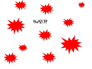
This exercise was to show how grouping can convey thoughts or themes. By grouping images together in different ways we are able to communicate a message. The way images relate to each other can support the idea the artist or designer is trying to get across.
For this exercise we used Power Point to create seven different slides with seven different words and ten shapes to express the words on each slide. I used shape, size and color to emphasize my point in the slides. It is amazing how these things can effect a viewer's concept of an idea.
For this exercise we used Power Point to create seven different slides with seven different words and ten shapes to express the words on each slide. I used shape, size and color to emphasize my point in the slides. It is amazing how these things can effect a viewer's concept of an idea.

Unity - For this word I chose the plus symbol because unity to me adding together to be one. The circle is always something I think of when I think of unity as well. And the color yellow is because it's a happy color and to me I think of happiness when I think of unity.
 Celebration - This was the hardest slide for me. I had a hard time trying to decide how to illustrate Celebration with grouping, shapes and colors. I chose stars because they, to me, are synonymous with celebrating! I chose bright colors, pink and yellow, to emphasize high spirits. I tried to group the stars in a way similar to a firework or confetti being thrown. It was a hard concept for me to express with grouping.
Isolation - For this slide I chose the cloud shape because it can be happy or sad. I separated one cloud from the others and made it blue because I think of sad rain clouds when I think of blue clouds. The other white clouds are in the opposite corner and are together in one large group but also in smaller clusters. It's kind of like a party when one person doesn't really know anyone. People are gathered in clusters of their friends but that one person is the odd one out. It can feel very isolated.
 Escape - For this slide the idea I had was escaping from the crowd, from doing what everyone else is doing. I chose arrows to show the different direction the one is going from the others. The formation of the others is to show similarity in those arrows. In my head as I was thinking of this the crowd I had in mind was girls in high school all doing the same things and going against the stream to escape that sameness, that's why I chose purple, a girly color.
Intimidation - For this slide I chose lightning bolts which can instill fear. I made one larger than the others to tower over the others, another way people sometimes instill fear in others. The other lightning bolts are cowering in the corner in a a tight cluster implying that they are scared of the other, larger lightning bolt. I chose the color black because it is an ominous color.
 Logic - The idea that comes to mind when I think of logic are puzzles. There are correct ways for things to be and there is organization and structure. I chose the octagon because of the straight edges and obvious shape. The grouping of the ten shapes is very structured and organized in a pyramid formation.

Thanks for sharing your imagery and thoughts. I would like to know even more about each image. Why did you choose the symbols and grouping techniques on each image? How that help convey the intended concept? Thanks!
ReplyDelete