Monday, February 28, 2011

Components - Gestalt & Icons

Exercise 1
Gestalt Theory

The basic concept of the Gestalt theory is that the whole is greater than the sum of it's parts. This theory is related to visual perception and the study of shapes and patterns. There are four principles. For this exercise we were to create a simple picture of one of the concepts. I chose to try two different concepts.

Closure - We attach meaning to visual displays


I used simple shapes in PowerPoint to create this picture. There are two arches that are not touching but the eye still sees the oval that the two arches create.


Similarity
- We group similar objects together in a meaningful way. 


Again, I used simple shapes in PowerPoint to create a pattern. The eye will automatically group together the circles and the stars.


The other principles are:
Proximity - We group things that are physically close to one another, in a meaningful way.
Continuity - We look for unity in objects


Exercise 2
Icons

This exercise was to make an icon using an everyday object. I chose a picture of a bicycle from stockvault.net
Original


We then selected identifiable parts of the object. I circled the handlebars, seat, wheel, and peddles. 
Step 1

I chose the peddles and part of the tire as the most identifiable part.
Step 2

I then used PowerPoint to create an icon of the section of the bike. I used simple shapes to create a simple grey and black picture of the bike.
Step 3 - Icon

I really enjoyed creating this icon and think it turned out pretty well!

Tuesday, February 22, 2011

Composition - Color & Emphasis

Exercise 6
Color

For this project we started with an image. I chose a high heel from stockvault.net.


I opened the shoe in Photoshop and deleted the background copying the picture to a new window. I copied the shoe three times and changed the size of each. I changed the color of the middle shoe to a bright red.


Exercise 7
Past & Present

For this exercise we were to choose a picture of a street scene an change the picture to black and white to make it look old, and then choose one part of the picture to leave in color to make it look current. I chose a picture of a busy intersection on stockvault.net. 


I opened the picture in Photoshop and changed the original photo to black and white using the Adjustments panel.  I then used the magnetic lasso tool to select the yellow bus. I pasted that on the top layer. I used the saturation tool to make the bus a brighter color. I also adjusted the different colors in the black and white layer to make the colors even more different than the yellow bus.


I really enjoyed working on these exercises to use color to emphasize something in the pictures. I especially enjoyed the Past & Present exercise and even tried a couple other pictures.


The original of this picture was not as colorful so it was a little harder to change a colored item and make it stand out. I had to do a lot of changing saturation and colors in black and white. But it is a fun thing to play with.

Composition - Alignment

Exercise 5
Alignment


This exercise is to demonstrate alignment. For this exercise I used PowerPoint to design an ad for an imaginary company. I chose to align the picture in the center. The text under it is also center aligned.  I made the picture large to draw the viewer's attention.

Friday, February 4, 2011

Composition - Grouping & Theme

Exercise 4
Grouping & Theme

This exercise was to show how grouping can convey thoughts or themes. By grouping images together in different ways we are able to communicate a message. The way images relate to each other can support the idea the artist or designer is trying to get across.
For this exercise we used Power Point to create seven different slides with seven different words and ten shapes to express the words on each slide. I used shape, size and color to emphasize my point in the slides. It is amazing how these things can effect a viewer's concept of an idea.


Unity - For this word I chose the plus symbol because unity to me adding together to be one. The circle is always something I think of when I think of unity as well. And the color yellow is because it's a happy color and to me I think of happiness when I think of unity.

Celebration - This was the hardest slide for me. I had a hard time trying to decide how to illustrate Celebration with grouping, shapes and colors.  I chose stars because they, to me, are synonymous with celebrating! I chose bright colors, pink and yellow, to emphasize high spirits. I tried to group the stars in a way similar to a firework or confetti being thrown. It was a hard concept for me to express with grouping.

Isolation - For this slide I chose the cloud shape because it can be happy or sad. I separated one cloud from the others and made it blue because I think of sad rain clouds when I think of blue clouds. The other white clouds are in the opposite corner and are together in one large group but also in smaller clusters. It's kind of like a party when one person doesn't really know anyone. People are gathered in clusters of their friends but that one person is the odd one out. It can feel very isolated.

Escape - For this slide the idea I had was escaping from the crowd, from doing what everyone else is doing. I chose arrows to show the different direction the one is going from the others. The formation of the others is to show similarity in those arrows. In my head as I was thinking of this the crowd I had in mind was girls in high school all doing the same things and going against the stream to escape that sameness, that's why I chose purple, a girly color.


Intimidation - For this slide I chose lightning bolts which can instill fear. I made one larger than the others to tower over the others, another way people sometimes instill fear in others. The other lightning bolts are cowering in the corner in a a tight cluster implying that they are scared of the other, larger lightning bolt. I chose the color black because it is an ominous color.

Logic - The idea that comes to mind when I think of logic are puzzles. There are correct ways for things to be and there is organization and structure. I chose the octagon because of the straight edges and obvious shape. The grouping of the ten shapes is very structured and organized in a pyramid formation.


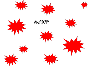
Anarchy - The idea behind this slide was the chaos and disorganization of the shapes. The star burst shapes are loud and chaotic, jarring. The color red is bright and bold. I made the shapes different sizes to also give a feeling of unruliness.